Stanford Athletics 2017-18
The Stanford Athletics’ 2017–18 look and feel evolved out of the 2016–17 visual identity, taking advantage of the recognition and positive associations that existed with the previous identity, and gaining the benefits of a meaningful brand advancement over time.
I developed the 2017–18 Stanford Athletics identity to be clean, brilliant, and elegant with an edge. Marketing collateral primarily featured white backgrounds, stadium or flood lights in the background where applicable, light flares, a carbon fiber texture, subtle red gradients and a cardinal/grayscale color palette. All graphics centered around powerful action photography of Stanford student-athletes, rendered with high clarity. The textured cardinal and white design elements were the visual threads holding the campaign together across channels.
For all creative content, the two main drivers behind design decisions were to 1) facilitate ease of understanding by the average fan and (2) capture the spirit of Stanford Athletics—a sense of confidence, humility, pride, ambition, strength and intensity.
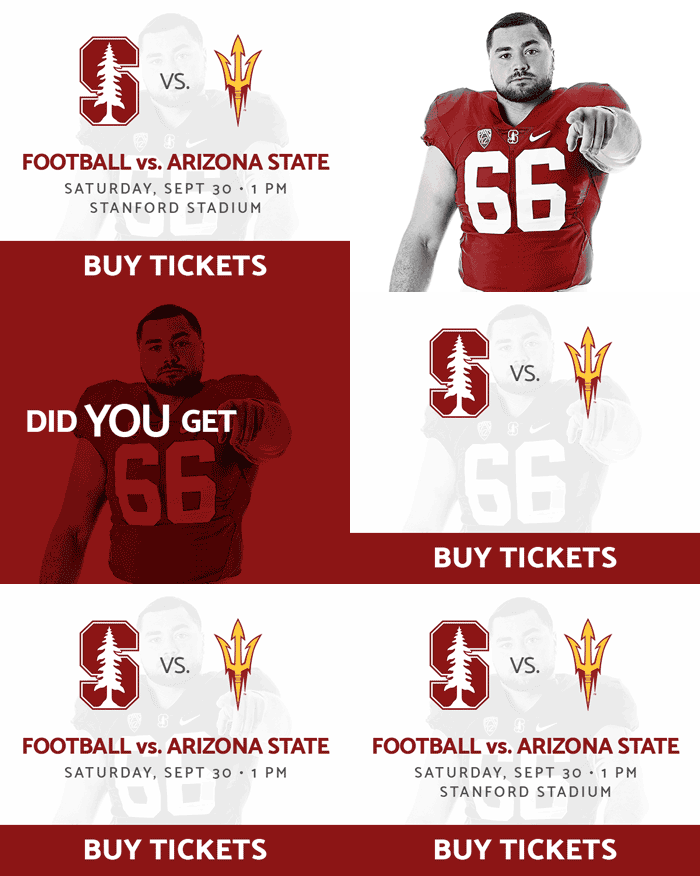
Below are examples of original designs for marketing collateral, email and social media graphics, animated banner ads, and video board graphics (which could not based in a white background like the other graphics, as the display would temporarily blind our fans in the venue).


